Reports in Albert
Reporting in Albert allows you a way to easily generate a cohesive view of the structured data you capture in other parts of the platform, such as through Project, Worksheets, Tasks, and Inventory.
What is an Albert Report?
Reports in Albert allow you to query, organize, and analyze all of the structured data that you capture in Albert, providing you valuable insights on the data that you've generated.
Albert reports are designed to avoid static Excel spreadsheets and presentations. As data is captured, reports in Albert will update in real time, so you don’t need to constantly copy and paste your data for visualizations and plots.
For information on how to access the new Reporting functionality in Albert, visit this help article.
Creating a New Report
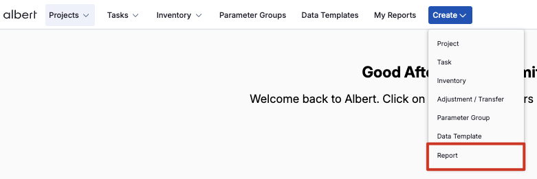
You can create a Report within Albert from any page by clicking the Create button in the navigation panel at the top of the page and selecting 'Report'.
From there, the Report creation modal will appear, prompting you to fill out information about your Report.
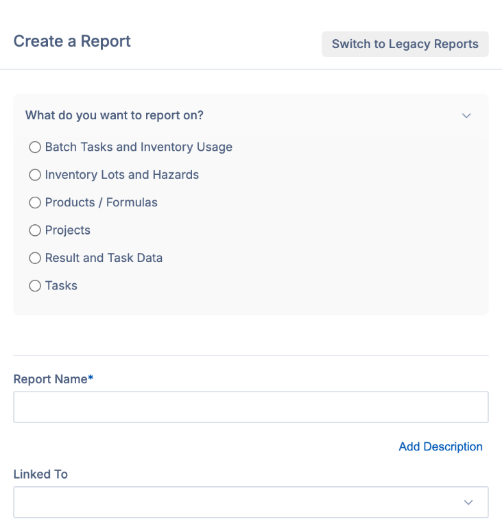
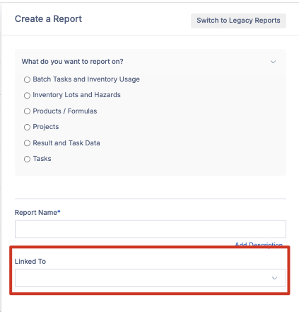
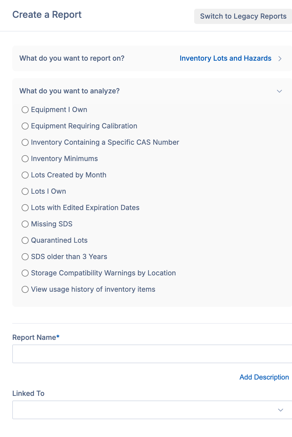
When you go to create a new report, you'll be prompted to select what you want to report on
and from there, what you want to analyze.
Make your selections, and then Albert will ask you how you'd like to filter your data in order to render the appropriate results. Note that these filter options will vary based on the selections you make in the above steps.
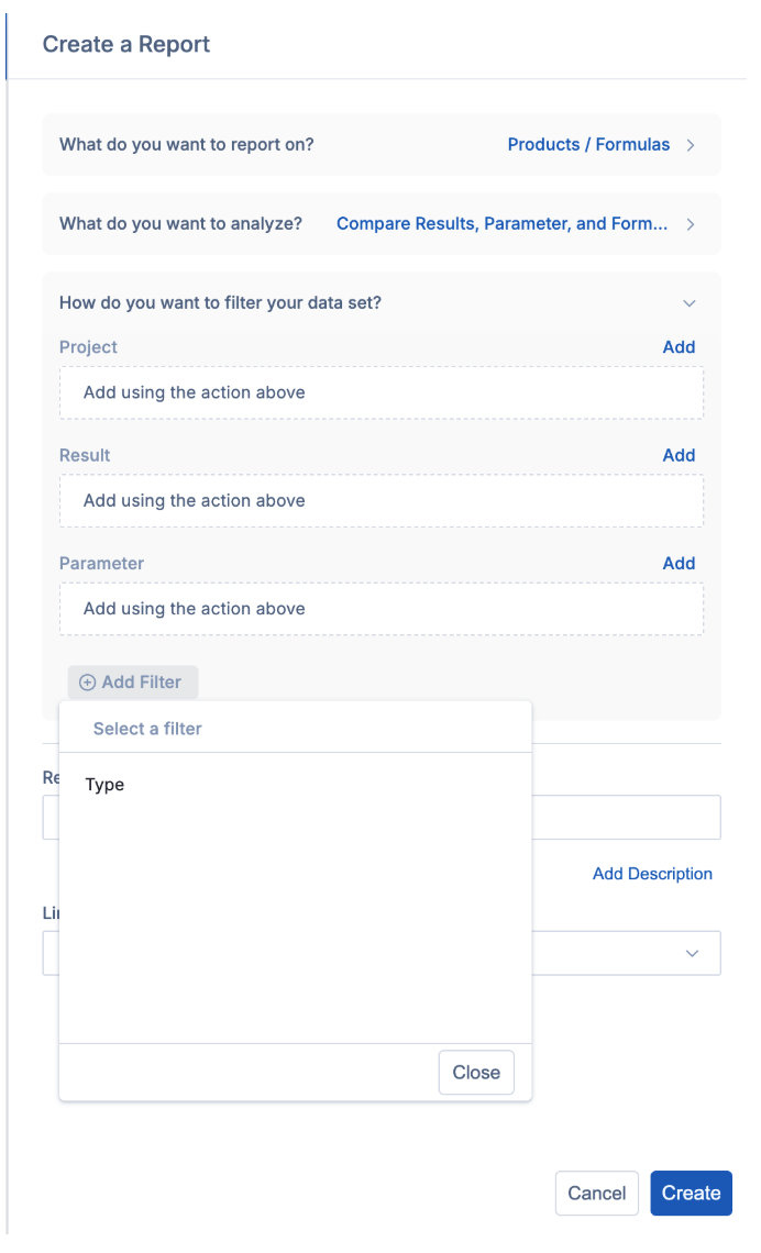
Once you've filled everything out, select Create. From there, you're able to edit your report to further refine your data and add any pivoting that may be necessary.
Editing a Report
To edit a report that's been created, click on the Edit Table option as shown by the arrow below.
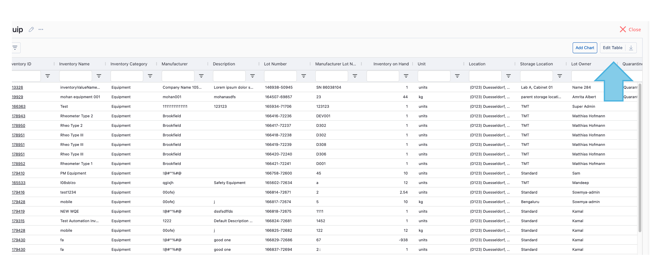
This is where you can apply the below functions to your data:
Group Row By - This will allow you to apply row groups to your data. A row will be created for each record matching the set criteria.
Summarize Values By – Set the field you want to aggregate. This will aggregate values based on the row groups and column breakdowns applied. See additional information below on aggregation options.
Breakdown Columns By – Set the field that you want to become your columns. A column will be created for each unique record.
An example is shown below:

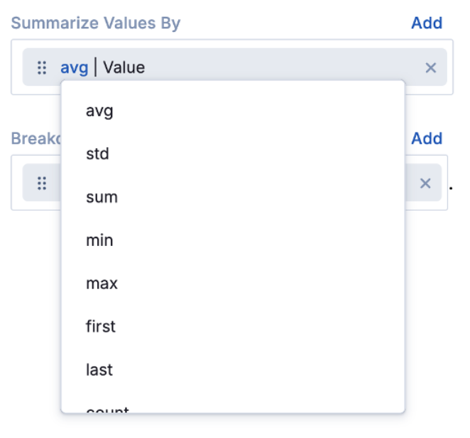
Further, clicking on the blue text above will open data aggregating options. Changing these options will auto-update your table:
Avg – This will take the average of ALL data that matches your row group and column breakdown format (NOTE – all data will be included in the aggregation)
Std - This will take the Standard Deviation of ALL data that matches your row group and column breakdown format (NOTE – all data will be included in the aggregation)
Sum – This will take the Sum of all values in the aggregation
Min - This will show the Minimum value that is aggregated
Max - This will show the Maximum value that is aggregated
First - This will show the First value that is aggregated. Works great with string data!
Last - This will show the Last value that is aggregated. Works great with string data!
Count - This will Count the distinct aggregated values
Concat - This will Concatenate the distinct aggregated values
Avg / Concat – Depending on the data type, this will either show the average (if all values are numeric) or concatenate the strings (if any values are non numeric)
Avg +- std – This will combine the avg and std aggregation methods listed above to view together.
Filtering your Report
There are two options for filtering your data: 1) by selecting the filter icon in your Report's header, which will filter all of the data in your report, or 2) by selecting the column filters available in each column in your report.

Changing your Table Display
After you've done initial editing of your table, you can modify the view or display of your data in the Table Display tab.
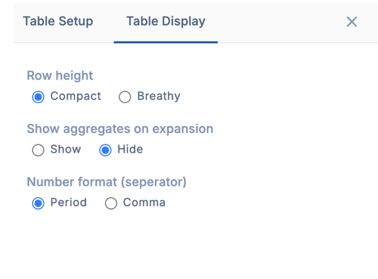
The Table Display options are described below:
Row Height – adjust the density of your data to be compact (dense) or breathy (less dense)
Show / Hide Aggregates – Determine if all row groups should appear in a single column (show) or in multiple columns (hide). By hiding aggregates, there will not be an aggregation row in the parent row.
Number Format – determine your decimal separator to update the format between common EU and US number formats.
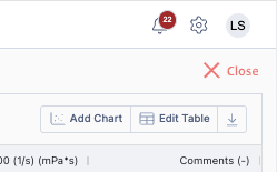
Adding a Chart
Charts can be added by selecting "Add Chart" in the upper right-hand corner of the window. Prior to creating your chart, it is important to ensure the data in your report is properly filtered and pivoted.
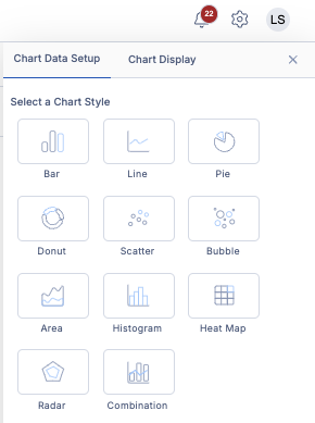
After clicking Add Chart, you will be prompted to select your chart style.
Once you select your chart style, you can customize your chart's data setup and your display settings, such as your chart theme, chart title, axis titles, and more.

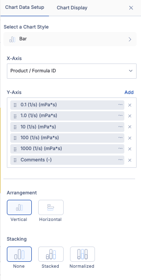
These tabs allow you to further customize your chart to improve readability and understanding of your chart. All chart display options are listed below:
Chart Theme
Chart Title
Subtitle
Axes Titles
Footer
Show values on data points
Legend & Legend Position
Convert axes to log-scale
Show grid lines per axis
Once you're done changing these settings, you should have a live chart in your report that will update as new data flows into it. Here's an example pie chart created within Albert:

Finding a Report Later
Reports can be found in two ways: by searching within Albert or from the linked project. To find a report in Albert, navigate to My Reports, which will load all reports that you have created. From there, you can scroll or search or your desired report.
Optionally, you can also link reports to a project to access your Report directly from your project. To link your Report to your project, input the project ID in the Linked To field when creating your report.